Page History
Upon opening or creating a new form, the Form Editor loads with the Design subtab as the default view. The following subtabs are also included to allow users to set additional features for a form:
- Parts
- Tab sequence
- Security
These subtabs are discussed in the Form Editor Subtabs section.
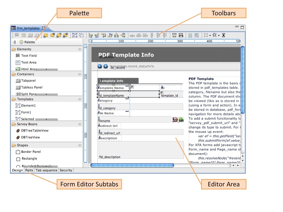
The Form Editor Design subtab consists of 3 main parts (see following image):
- Toolbars
- Palette
- Editor Area
Toolbars
The toolbar area, by default, includes the following toolbars from left to right, separated by vertical lines in the screenshot below: 
- Place Element Wizards – contains buttons for placing a dataprovider field, an image, a portal, a split pane, and a tabpanel. These buttons feature a wizard to quickly set properties for the placed element. These buttons can also be used to set properties for selected, previously placed elements.
- Layering – contains buttons for setting front/back arrangement of a selected element.
- Grouping – contains buttons for grouping/ungrouping of selected elements
- Alignment – contains buttons for aligning elements (left, right, top, bottom, center, and middle).
- Distribution – contains buttons for setting space distribution of selected elements.
- Sizing – contains buttons for setting the same width or height for a group of selected elements.
- Actions – contains buttons for form actions (set tab sequence and save as template).
- Editor Preferences – contains buttons for showing/hiding visual cues such as alignment guides, rulers, indicators and the grid; setting snap modes; and showing/hiding inherited elements. Note: Preferences selected via this toolbar only apply to the active form; selections revert to default when the form is closed and reopened.
Each of these toolbars can be shown or hidden via the toolbar's contextual menu (right-click).
Palette
The Palette gives easy access to items that can be incorporated into forms, organized into five drawers:
- Elements
- Containers
- Templates (drawer only visible if templates exist in a solution)
- Servoy Beans
- Shapes
Each of these drawers are discussed in the remaining sections of this chapter.
Choosing a Palette Layout View
Several palette layout view options are available. The default layout is List, in which all available items are listed in a scrollable list with an icon and full name for each. The other layout options include a column arrangement, icons only, and icon with full name and a brief description.
Other Palette Customization Options
You can also use the palette context menu to:
- View large icons.
- Customize the palette by hiding buttons, editing button names and descriptions, and changing the arrangement of visible icons by moving them up or down.
- Change item drawers' behavior.
Lastly, you can click on Settings in the contextual menu to set general Palette settings. A full list of the palette customization options can be found in the Developer Reference section.
Editor Area
The Editor Area facilitates the graphical design of forms. By default, vertical and horizontal rulers are shown with pixel units. Alignment guides can be created by clicking anywhere on the ruler.
The Editor Area can be customized by accessing the contextual menu (right-click in an empty space on the Editor Area) and clicking Preferences. The following are some of the features that can be customized. A full list is given in the Developer Reference section.
- Showing/hiding rulers and choosing ruler units (pixels, centimeters, inches).
- Showing the grid and setting grid properties
- Showing/hiding alignment guides, anchoring indicators, and same-size indicators
- Specifying keyboard resize and move step sizes
The following section discusses how to get started with designing a form.
Overview
Content Tools
Activity