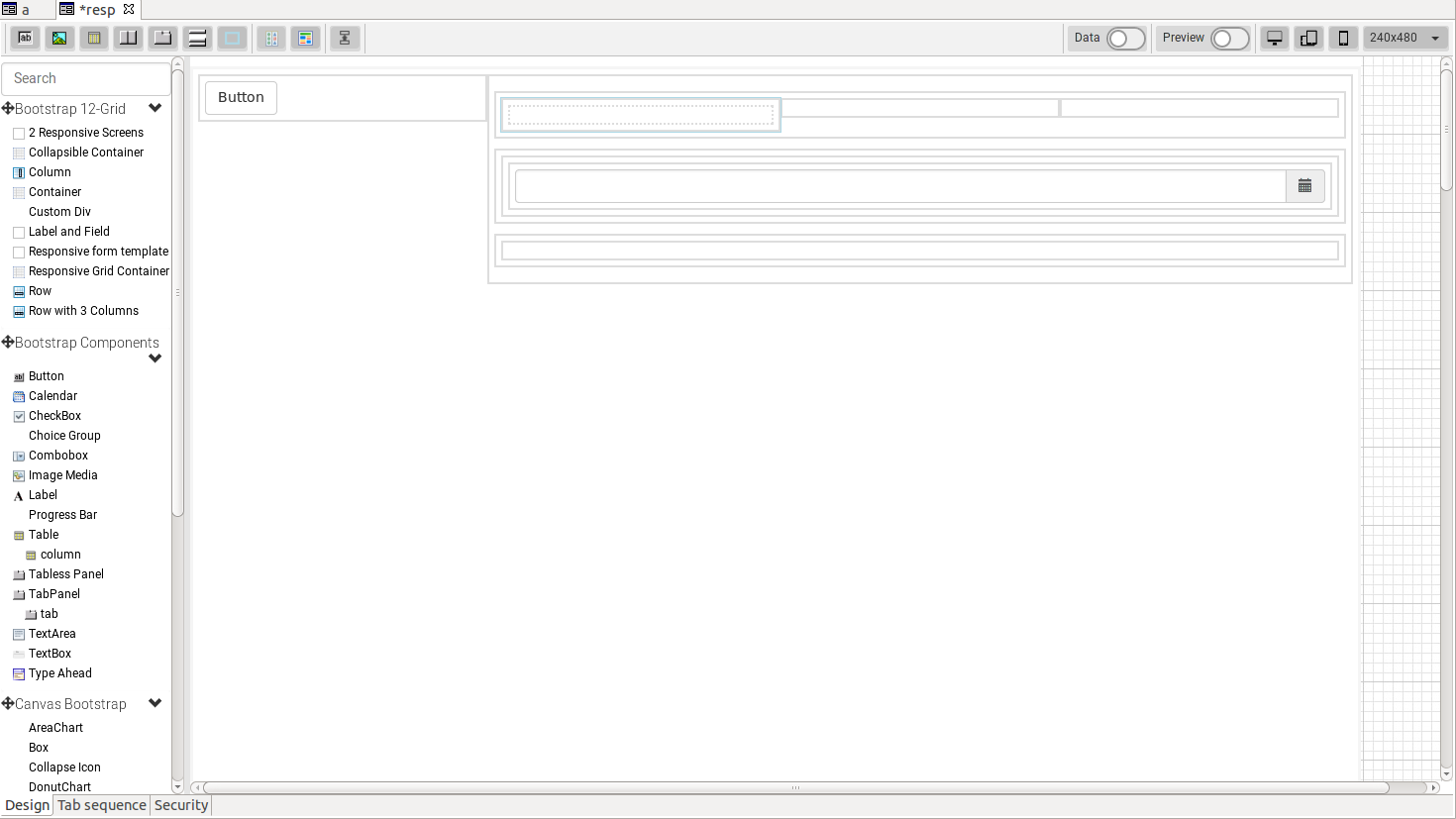
Servoy 8 supports "responsive layout" forms. A form that is in responsive layout will re-layout its components based on the width of the browser. Behind the scenes, Bootstrap 12 grid is used to do the layout.
Responsive forms can only be edited with the HTML form editor which is enabled by default in Servoy 8.
When dragging an element from the palette, the editor automatically highlights the existing layout structure. In order to see where the component will be dropped, the cursor holding the element (component or layout) has to stop moving for at least 200 ms. After that, the editor will re-layout the form with the new component in that position. If the mouse button is released, the component will actually be dropped in the form. If, instead, the cursor will be moved, the editor will re-layout the form again, but this time without the new component.
After the component is dropped, the editor will remove the highlighting of the layout structure and will render the form as it would look like in a "real" client.
The "preview" setting, if switched on, will keep the layout highlights all the time.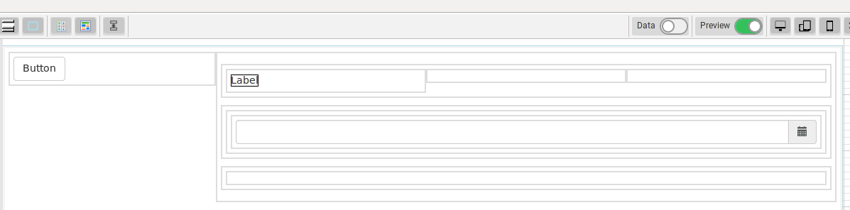
Layouts can be nested according to the following rules:
"container" can contain "row"
"row" can contain "column"
"column" can contain "component", "row", "div", "3fields", "labelfield", "responsivetable", "collapsible", "2screens"
"div" can contain "component", "div"
Overview
Content Tools
Activity