This section describes how to create and save a new form, place elements on a form, and access and modify element properties.
In This Chapter
Creating a New Form
1. You can create a new form using one of three methods:
- Via the File menu (File > New > Form)
- By right-clicking on a solution in the solution explorer and selecting Create New Form.
- By pressing the New Wizard button on the Servoy Developer Toolbar.
Note: You must be in an active solution to create a new form.
The New Form window will appear:
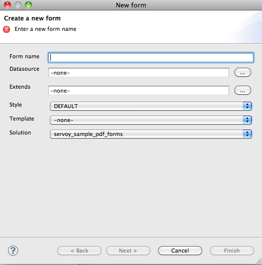
2. Enter the following information:
- Form name. If left unfilled, Servoy will automatically choose a name when you select a datasource.
- Datasource. Clicking on the button next to the datasource entry field will reveal a list of available datasources.
- Extends. An existing form can be used as a basis for extending into a new form can extend an existing form. The new form inherits the user interface and business logic that the existing form contains. Note that both forms need to come from the same datasource.
- Style. Servoy comes with many CSS style themes, or you can create your own (see Programing Guide for details).
- Template. If desired, a previously created Form Template can be loaded onto the form.
- Solution. The solution is automatically preloaded (the active solution that the form is created on) Note: In cases where a solution contains modules, the user could select one of the modules to create a new form in.
3. Click on the Next button to add dataproviders to the form if you wish (you can also add these later using the Form Editor as you develop the form). Multiple dataproviders can be selected by holding down the CTRL key.
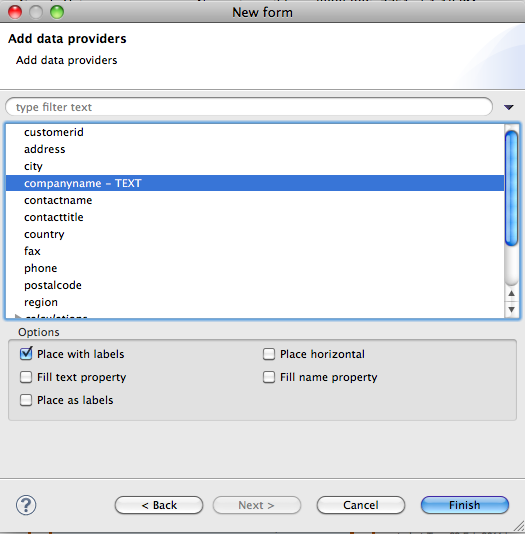
4. Select your desired options to set on the selected dataproviders:
- Place with labels adds a text label to each field.
- Place horizontal arranges the selected fields horizontally from left to right, as in a table.
- Fill text property adds the dataprovider name to the text property.
- Fill name property adds the dataprovider name to the name property, enabling access to the field via scripting.
- Place as labels enables a double-click event on the field, while locking the content to prevent editing.
5. Click Finish. A new Form Editor is opened for the newly created Form.
Saving a Form
The new form is saved with the preselected dataprovider fields upon creation. When you make changes to the form, an asterisk next to the form's name at the top of the Form Editor indicates that there are unsaved changes. You can save the form by:
- Using the keystroke CTRL-S.
- Clicking on File > Save.
To revert unwanted changes, use the context menu on the form and select Revert Form (at the top of the list).
Grouping Forms
Sometimes a solution contains large numbers of forms, and the need to group them in a logical manner becomes obvious. In order to group the forms from within a solution, working sets are used.
Working sets are acting like 'folders' in which forms are added to provide a better structure of the whole set of forms contained by a solution.
A working set can be added by right clicking on the Forms node from under the active solution, and choosing Add working set. A new working set can be created or an existing working set can be chosen from the list of existing working sets, to which the project will be added.
When a working set is added, it will be shown under the Forms node, and forms will be able to be dragged and dropped in and out of it.
Note that all working sets are stored in the resources project, which allows them to be shared between developers through the team provider used.
Placing Elements on a Form
You can place elements on a form using several different ways:
- Drag and drop an element from the Palette.
- Click-select and click-place an element from the Palette. With this option, you can place the same element multiple times by holding down the control key as you place elements.
- Select the element to place from the main Menu bar item Actions, which also lists the keyboard shortcuts.
- Use Keyboard shortcuts.
Click on an appropriate Elements Toolbar wizard button.
TIP:
Elements can be placed with a custom size when dragging and dropping an item from the Palette by holding down the left mouse button upon reaching the editor area and dragging the until the desired shape and size is reached.
Note:
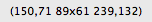
The status bar at the bottom of the Servoy perspective displays sizing information while the element is being drawn or resized. In the example below, the first pair of numbers represent the x & y coordinates of the upper left corner of the shape, and the second pair shows the size in pixels. Upon setting the final size, the x & y coordinates of the lower right corner of the element appears.
The following elements are available:
- Text Field – a single-line text field
- Text Area – a multiline text field
- HTML area – a multiline html field
- RTF area – a multiline rich text format field
- Password field – text entered into this type of field is hidden
- Calendar – a field featuring a popup calendar
- Image Field – a field designated for loading images
- Combobox – a drop-down menu
- Type Ahead – a field that shows matching values as data is entered
- Radio Button – a list that displays possible values where only one can be selected
- Checkbox – a list that displays possible values where multiple items can be selected
- Label – a field used to place text or provide labels for elements
- Button – an element that triggers a local or global method
- Portal – a data viewer/editor for data related to the active form
Note: A text field can be linked to a datasource (once placed, the datasource can be assigned by double-clicking the element, or by selecting the field and then clicking on the Text Field icon in the Elements toolbar.)
Setting Properties for Each Element
The Properties view allows you to set some formatting properties for each element. Examples include size, background, border type, fonts, and margins. More details can be found in the Developer Reference section.
The Properties view loads by default when you open Servoy. If it has been minimized, it can be re-loaded by clicking on the menu item Window > Show View > Properties.
The next section describes the layout tools available in Servoy 6.
Overview
Content Tools
Activity