Page History
...
| Note |
|---|
Only one of the contains and excludes properties should be present in a layout specification. If excludes is present, then contains will be ignored. |
The designStyleClass
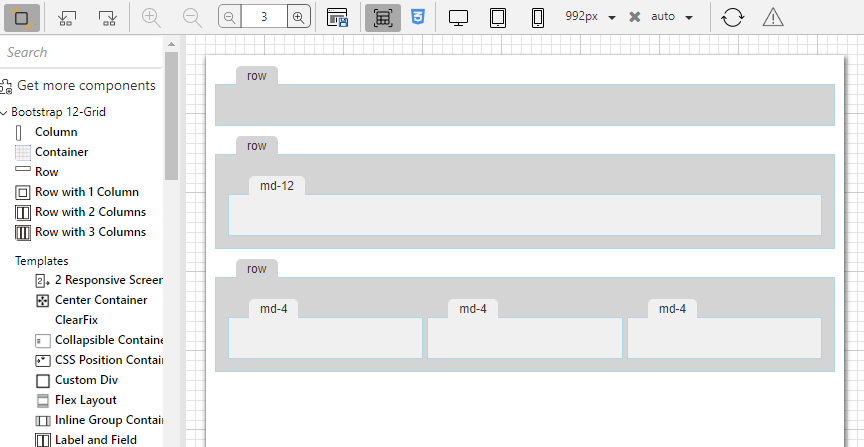
The designStyleClass property is used to express how the layout container is displayed in the Exploded view. The Exploded view makes the structure of layout containers more visible in the designer.
In the image below we have 3 rows: the first one is empty, the second one contains one column and the third contains 3 columns.
Let's take for instance the 12 grid Row layout container.
| Code Block | ||||
|---|---|---|---|---|
| ||||
{
	"name": "row",
	"displayName": "Row",
	"icon": "12grid/row.png",
	"designStyleClass" : "rowDesign",
	...
} |
Therefore, when a responsive form is open in the Form editor and the Exploded view button is pressed, all rows have the rowDesign styleclass because we have specified it as the designStyleClass for layout containers of type 12 grid row.
| Info | |||||||
|---|---|---|---|---|---|---|---|
| |||||||
The design style classes of all the layout containers in the package, should be defined in a css file on the package level. The MANIFEST.MF of the layouts package should contain the paths to the CSS-DesignLibs.
|
To make the 12 grid row display like this in the Exploded View,
we need to add the following css rules to the 12grid_design.css:
| Code Block | ||||
|---|---|---|---|---|
| ||||
/* Please note that the margin and padding are marked as important to avoid the exploded view style to be overruled by any css defined in the solution. */
.rowDesign {
    background-color : #D3D3D3;
    border : 2px solid inherit;
    margin : 30px 10px !important;
    min-height : 40px;
    padding : 10px !important;
}
|
Overview
Content Tools
Activity