Page History
...
- Via the File menu (File > New > Form)
- By right-clicking on a solution in the solution explorer and selecting Create New Form.
- By pressing the "New Wizard" button on the Servoy Developer Toolbar.
| Info |
|---|
Note: You must be in an active solution to create a new form. |
The "New Form" window will appear:
...
- Drag and drop an element from the Palette.
- Click-select and click-place an element from the Palette. With this option, you can place the same element multiple times by holding down the control key as you place elements.
- Select the element to place from the main Menu bar item Actions, which also lists the keyboard shortcuts.
- Use Keyboard shortcuts.
- Click on an appropriate Elements Toolbar wizard button.
Tip title TIP: Elements can be placed with a custom size when dragging and dropping an item from the Palette by holding down the left mouse button upon reaching the editor area and dragging the until the desired shape and size is reached.
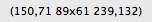
Info title NOTENote: The status bar at the bottom of the Servoy perspective displays sizing information while the element is being drawn or resized. In the example below, the first pair of numbers represent the x & y coordinates of the upper left corner of the shape, and the second pair shows the size in pixels. Upon setting the final size, the x & y coordinates of the lower right corner of the element appears.
...
- Text Field – a single-line text field
- Text Area – a multiline text field
- HTML area – a multiline html field
- RTF area – a multiline rich text format field
- Password field – text entered into this type of field is hidden
- Calendar – a field featuring a popup calendar
- Image Field – a field designated for loading images
- Combobox – a drop-down menu
- Type Ahead – a field that shows matching values as data is entered
- Radio Button – a list that displays possible values where only one can be selected
- Checkbox – a list that displays possible values where multiple items can be selected
- Label – a field used to place text or provide labels for elements
- Button – an element that triggers a local or global method
- Portal – a data viewer/editor for data related to the active form
| Info |
|---|
Note: A text field can be linked to a datasource (once placed, the datasource can be assigned by double-clicking the element, or by selecting the field and then clicking on the Text Field icon in the Elements toolbar.) |
Setting Properties for Each Element
...
Overview
Content Tools
Activity