Page History
...
| Code Block | ||||
|---|---|---|---|---|
| ||||
{
	"name": String layout name,
	"displayName": String more descriptive name that is shown in the designer,
	"version": the version, the same as for the components (integer),
	"definition": A reference to the json file of this layout,
	"icon": A reference to the icon shown in designer,
    "preview": A reference to the preview gif to be displayed, default is null ,
	"designStyleClass" : A css class to be added when the wireframeexploded view is enabled in designer, if not specified it fallbacks to 'customDivDesign'
	"contains": ["Specifies an array of components/layouts which can be added to this layout container"], //the first one should be the one which is most used
	"excludes": ["Used to specify that a layout can contain any component or layout except this list.
                  If present, the 'contains' property is ignored.
				  See the column.spec example below for more details."]
	"topContainer": Used to determine whether this layout container can be added directly into the root of the form. The default value is false,
	"tagType":The tag type for HTML output. The default value is 'div',
    "deprecated": string to mark the component as deprecated - if it is deprecated, default value null (not deprecated)
    "replacement": "package-layout", (optional) in case of deprecation, developer will provide a quick fix for such layouts to be automatically changed to the given replacement.
                   The default value is null
	"model": {
		 "propertyName": type description, optional default value - the model properties are generated
					     on the tag as HTML attributes
         "tagType": "string"  // optional attribute if the tagType should be configurable in the developer
	}
} |
It is worth to mention that the 'tagType' property is a bit more special. It is a top level property which specifies the default value for the tagType, but it can also be a model property. In this case, it shows in the properties view and the user is able to change its value.
The json config file is for the default properties (class="row") which are not changeable by the servoy developer (if the model area of the spec file doesn't specify them) but also for making composite layouts, so you can drop full structures at once.
| Code Block | ||||
|---|---|---|---|---|
| ||||
{
	"layoutName":The real name of the toplevel layout if this layout is a composition of layouts (optional),
	"class":A sample property that will be set as the attribute when such a layout container is created (optional),
	"children": An array of child components/layouts with their default values (optional)
} |
...
For instance, the "row with 3 columns" layout is defined as follows:
...
| Code Block | ||||
|---|---|---|---|---|
| ||||
{
	"layoutName":"row",
	"class":"row",
	"children" : [
		{
			"layoutName":"column",
			"model": {
				"class":"col-md-4"
			}
		},
		{
			"layoutName":"column",
			"model": {
				"class":"col-md-4"
			}
		},
		{
			"layoutName":"column",
			"model": {
				"class":"col-md-4"
			}
		}
	]
} |
...
In the following example, it is specified that the 'column' layout can contain any layout from the current package and any component except the one named or with layoutName "container".
...
We can also disallow adding any component with "excludes": ["component"]. However, if we want to allow all components but a specific one, then we need to use the "contains" property instead of "excludes", in which we enumerate all possible components that this layout accepts.
| Info | ||
|---|---|---|
| ||
If both contains and excludes properties are missing from the layout spec file, then that layout will allow components as children. |
...
The possible values of the "contains" property are illustrated in the table bellow, it can either contain everything "*" or it can be an array containing layout names or the string "component":
| Contains Values | Explanation | Example 12grid package | The Add menu |
|---|---|---|---|
| * | may contain any layouts from the current package and any components from any packages | "contains": ["*"] |  |
<layoutName> |
| may contain layout with name <layout_name> or with the layoutName property <layout_name> from the current package | "contains": ["container"] |
| "contains": ["row"] |
| |||
| component | may contain any components from any package | "contains": ["component"] |  |
| enummeration of <layoutName> and optionally component | may contain the enummerated layouts from the current package and components from any packages | "contains": ["row","container","component"] |  |
...
If a specific layout can contain everything except a few other layouts or it cannot contain components, then it is better to use the excludes property instead of contains:
| Excludes values | Explanation | Example 12grid package | The Add menu |
|---|---|---|---|
| <layoutName> | may contain any layouts from the current package and any components except the layout with name <layout_name> or with the layoutName property <layout_name> | "excludes": ["row"] | 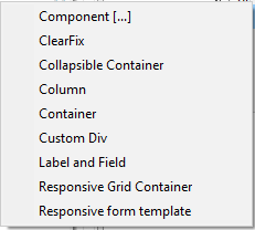 |
| component | may only contain layouts from the current package, excludes all components | "excludes":["component"] | 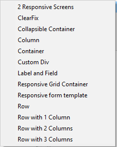 |
| enummeration of <layoutName> and optionally component | may contain all layouts from the current package except the ones enummerated; if components is specified, then the current layout cannot contain any components | "excludes": ["row","container","component"] | 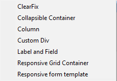 |
| Note |
|---|
Only one of the contains and excludes properties should be present in a layout specification. If excludes is present, then contains will be ignored. |
Layouts in NG2 supports also simple behavior through Angular Directives
| Code Block | ||||
|---|---|---|---|---|
| ||||
{
	"name": "collapsible",
	"displayName": "Collapsible Container",
	"version": 1,
	"icon": "12grid/collapsible/collapsible.png",
	"definition": "collapsible/collapsible.json",
	"designStyleClass" : "rowDesign",
	"categoryName":"Templates",
	"contains": ["12grid.div"],
	"topContainer": true,
	"directives": ["gridCollapse"],
    "tagType":"div"
} |
The above spec says with the "directives" tag that this tag (which is just a div according to the tagType) should have a Angular directive also generated on its tag that is the created at runtime and can influence the behavior of the collapsible div and/or its children.
This is done by saying in the manifest of the grid package that it is also an npm package with a angular module:
| Code Block | ||||
|---|---|---|---|---|
| ||||
NPM-PackageName: @servoy/12grid
NG2-Module: GridModule
|
Then the layout package must provide this angular npm package having that GridModule as a class an example can be seen here: 12grid/project at master · Servoy/12grid (github.com) with a the collapsible directive that adds behavior to the layout tag here: 12grid/collapse.directive.ts at master · Servoy/12grid (github.com)
The designStyleClass
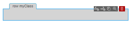
The designStyleClass property is used to express how the layout container is displayed in the Exploded view. The Exploded view makes the structure of layout containers more visible in the designer.
In the image below we have 3 rows: the first one is empty, the second one contains one column and the third contains 3 columns.
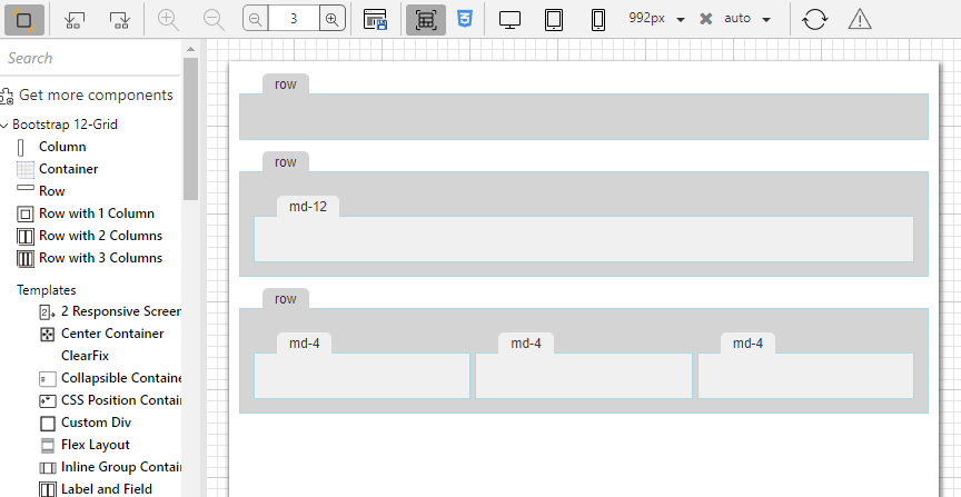
Let's take for instance the 12 grid Row layout container.
| Code Block | ||||
|---|---|---|---|---|
| ||||
{
	"name": "row",
	"displayName": "Row",
	"icon": "12grid/row.png",
	"designStyleClass" : "rowDesign",
	...
} |
Therefore, when a responsive form is open in the Form editor and the Exploded view button is pressed, all rows have the rowDesign styleclass because we have specified it as the designStyleClass for layout containers of type 12 grid row.
| Info | |||||||
|---|---|---|---|---|---|---|---|
| |||||||
The design style classes of all the layout containers in the package, should be defined in a css file on the package level. The MANIFEST.MF of the layouts package should contain the paths to the CSS-DesignLibs.
|
To make the 12 grid row display like this in the Exploded View,
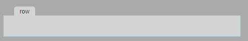
we need to add the following css rules to the 12grid_design.css:
| Code Block | ||||
|---|---|---|---|---|
| ||||
.rowDesign { background-color : #D3D3D3; border : 2px solid inherit; margin : 30px 10px !important; min-height : 40px; padding : 10px !important; } /* Please note that the margins and paddings should not be overruled by the css defined in the solution, otherwise the structure of the form in the exploded view could be compromised. This is why they are marked as !important since more specific selectors are not possible without polluting the solution css. */ /*The following is to show the "tab" of the row: */ .rowDesign::before { content : attr(svy-title); color : #333333; background-color : #D3D3D3; border : 1px solid #D3D3D3; border-bottom : none; border-top-left-radius : 5px; border-top-right-radius : 5px; font : 12px Arial, sans-serif; margin-top : -29px; margin-left : 10px; padding : 2px 10px; position : absolute; white-space : nowrap; overflow : hidden; text-overflow : ellipsis; } |
The "tab" title contains the container type and the list of styleClasses defined for that particular layout container. The value of the svy-title attribute is automatically inserted in the DOM of the form editor for each instance of the layout container.
In the image above the blue border and the menu with possible actions are added because the row was selected in the editor. These is default style for any selected container, the designer of the layouts package does not need to define anything.
For a more complex structure, the user can configure how many levels of containers wants to display to have a better overview especially for very complex forms:
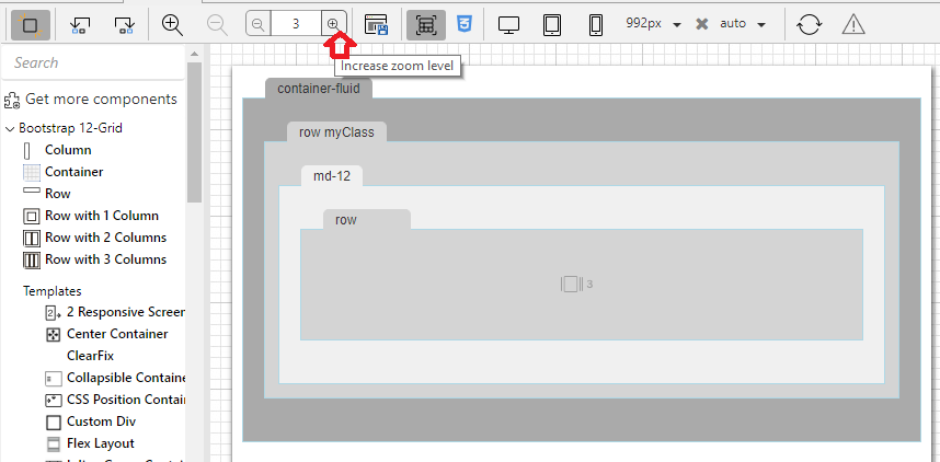
By default we show completely 3 levels of layout containers. The content of the first 3 levels of containers is shown, for the 4th level we notice there is a special icon with the number 3. This means that row has 3 children which are not visible in the current editor zoom level.
If the user wants to see the content of the row on the 4th level, they can increase the zoom level in the editor or zoom directly into the row container by pressing the "3 icon" (which becomes zoom on hover).
The designer of the layout package can add some rules in the design css by using .maxLevelDesign in conjunction with the design style class for that particular container (in our case .maxLevelDesign.rowDesign).
This is to avoid the containers to show too small and the tab title too large when in max zoom level. The rest of the styling for max level design is default css in the editor.
| Code Block | ||||
|---|---|---|---|---|
| ||||
.maxLevelDesign.rowDesign {
  min-height			: 100px;
  min-width			: 120px;
}

.maxLevelDesign.rowDesign::before {
  width 80px;
}
|
Overview
Content Tools
Activity