Page History
...
To make the 12 grid row display like this in the Exploded View,
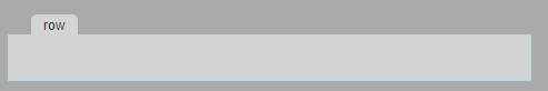
we need to add the following css rules to the 12grid_design.css:
| Code Block | ||||
|---|---|---|---|---|
| ||||
/* Please note that the margin and padding are marked as important to avoid the exploded view style to be overruled by any css defined in the solution. */ .rowDesign { background-color : #D3D3D3; border : 2px solid inherit; margin : 30px 10px !important; min-height : 40px; padding : 10px !important; } /* Please note that the margins and paddings should not be overruled by the css defined in the solution, otherwise the structure of the form in the exploded view could be compromised. This is why they are marked as !important since more specific selectors are not possible without polluting the solution css. */ /*The following is to show the "tab" of the row: */ .rowDesign::before { content : attr(svy-title); color : #333333; background-color : #D3D3D3; border : 1px solid #D3D3D3; border-bottom : none; border-top-left-radius : 5px; border-top-right-radius : 5px; font : 12px Arial, sans-serif; margin-top : -29px; margin-left : 10px; padding : 2px 10px; position : absolute; white-space : nowrap; overflow : hidden; text-overflow : ellipsis; } /* The |
The "tab" title contains the container type and the list of styleClasses defined for that particular layout container. The value of the svy-title
...
attribute
...
is
...
automatically
...
inserted
...
in
...
the
...
DOM
...
of
...
the
...
form
...
editor
...
for
...
each
...
instance
...
of
...
the
...
layout container.
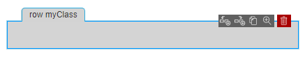
In the image above the blue border and the menu with possible actions are added because the row was selected in the editor. These is default style for any selected container, the designer of the layouts package does not need to define anything.
Overview
Content Tools
Activity