Page History
...
In the image above the blue border and the menu with possible actions are added because the row was selected in the editor. These is default style for any selected container, the designer of the layouts package does not need to define anything.
For a more complex structure, the user can configure how many levels of containers wants to display to have a better overview especially for very complex forms:
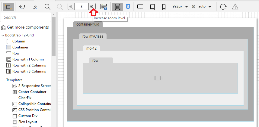
By default we show completely 3 levels of layout containers. The content of the first 3 levels of containers is shown, for the 4th level we notice there is a special icon with the number 3. This means that row has 3 children which are not visible in the current editor zoom level.
If the user wants to see the content of the row on the 4th level, they can increase the zoom level in the editor or zoom directly into the row container by pressing the "3 icon" (which becomes zoom on hover).
The designer of the layout package can add some rules in the design css by using .maxLevelDesign in conjunction with the design style class for that particular container (in our case .maxLevelDesign.rowDesign).
This is to avoid the containers to show too large when in max zoom level. The rest of the styling for max level design is default css in the editor.
| Code Block | ||||
|---|---|---|---|---|
| ||||
.maxLevelDesign.rowDesign {
  min-height			: 100px;
  min-width			: 120px;
}

.maxLevelDesign.rowDesign::before {
  width 80px;
}
|
Overview
Content Tools
Activity