Page History
| Stoc |
|---|
Solution StyleSheet
Stored in media folder
...
| Table of Contents |
|---|
The NGClient utilizes unprocessed CSS (3.0) to do all styling of solutions.
All possible CSS properties can now be used, like:
- All types of selectors
- Pseudo-classes
Solution StyleSheet
The stylesheet can be specified at solution level. It has to be stored in the solution's media node; for usage of images from media library inside the .css/.less please use relative URL's.
In the Solution Explorer Tree you can just create a new file (xxxx.css or yyyy.less) in your media folder of your solution, which can then be assigned to the stylesheet property of the solution node.
| Info | ||
|---|---|---|
| ||
| Less is library that helps you write .css that is more dynamic. It supports variables and other helpful concepts and it will compile the .less file into an actual .css file for the browser. If you are using Servoy 2019.03 or later (those have LESS support built-in) do try this out (just give a .less file to the solution instead of a .css file). These versions also have NG Client theme support - that is also based on .less. Go to .less web site for more information. |
1. Standard component CSS Selectors
StyleSheets for the Servoy Smart and Web Client could make use of Servoy specific type selectors.
In the NGClient, where the stylesheets are interpreted by the browser, these Servoy specific type selectors are not available. Below is a conversion table from the Servoy-specific-type-selectors used in smart / web clients to their equivalent classes used in the default components from NGClient:
...
| Smart/Web Client Type Selector | NGClient Selector |
|---|---|
body |
| .svy-body |
| button |
Multiple classnames
| .svy-button | |
| calendar | .svy-calendar |
| check | .svy-check |
| checkgroup | .svy-checkgroup |
| htmlarea | .svy-htmlarea |
| htmlview | .svy-htmlview |
| imagemedia | .svy-mediafield |
| combobox | .svy-combobox |
| even | .ui-grid-row:nth-child(even) .ui-grid-cell |
| field | .svy-field |
| footer | .svy-footer |
| form | .svy-form |
| header | .svy-header |
| label | .svy-label |
| listbox | .svy-listbox |
| odd | .ui-grid-row:nth-child(odd) .ui-grid-cell |
| password | .svy-password |
| portal | .svy-portal |
| radio | .svy-radio |
| radiogroup | .svy-radiogroup |
| slider | .svy-slider |
| spinner | .svy-spinner |
| splitpane | .svy-splitpane |
| tablesspanel | .svy-tablesspanel |
| tabpanel | .svy-tabpanel |
| textarea | .svy-textarea |
| textfield | .svy-textfield |
| typeahead | .svy-typeahead |
| selected | .ui-grid-row-selected div.ui-grid-cell (you have to use !important to override selected background color) |
| grid_header | .ui-grid-header-cell |
| grid_viewport | .ui-grid-header-viewport |
| title_header | .svy-titleheader |
| title_footer | N/A |
Also NGClient will output special classes for default components that can be used from solution css to easily style all components of same time. The name of the class is svy-componentName (so svy-label, svy-button, svy-calendar, svy-textfield...). Also, in NGClient we added two new classes: svy-layoutcontainer (for responsive layout containers) and svy-wrapper for wrapper div of the component (used in absolute layout).
1.1 Grid
The grid is based on UI-grid, there is a customizer that creates a stylesheet.
1.2 Tabpanel
Tabpanel is based on Bootstrap nav-tabs. To target the tabs, the following classes are available:
| Selector | Target |
|---|---|
| .nav-tabs | The tabs container |
| .nav-tabs > li | All the tabs of all tabpanels |
| .nav-tabs > li.disabled | Disabled tabs |
| .nav-tabs > li.active | The currently active tab |
2. Changes in css when compared to web client / smart client
In NGClient, Sevoy specific selectors that were in smart/web client css similar to
| Code Block |
|---|
label.bold {
	font-weight: bold;
} |
should become:
| Code Block |
|---|
.bold {
	font-weight: bold;
} |
If there are cases where the bold class is defined for two different components and their implementation is also different, then the following example (smart/web client css)
| Code Block |
|---|
label.bold {
	font-weight: bold;
}

field.bold {
	font-weight: 900;
} |
should become in NG Client:
| Code Block |
|---|
.label_bold {
   font-weight: bold;
}

.field_bold {
   font-weight: 900;
} |
After that, the styleClass property of the elements should be changed from "bold" to "label_bold" or "field_bold".
2.1 font-size
The "margin" css property from smart/web client should be changed with the "padding" property, so
| Code Block |
|---|
label {
	margin: 1px 2px 3px 4px;
} |
should become in NG Client:
| Code Block |
|---|
.label {
	padding: 1px 2px 3px 4px;
} |
In the webclient, the font-size property is changed at runtime, so in order to keep the same runtime sizes in the NGClient, the css files should be updated using the following functions:
for sizes specified in pt:
ngclient_value = 3/4 * webclient_value
for sizes specified in px:
ngclient_value = 4/3 * webclient_value
For example:
| Code Block |
|---|
field.label {
	font-size: 20pt;
}

field.textfield {
	font-size: 20px;
} |
should become
| Code Block |
|---|
.label {
	font-size: 15pt;
}

.textfield {
	font-size: 26px;
} |
2.2 styleClass precedence over default servoy selectors (.svy-field, .svy-combobox, .svy-textfield, etc...)
In NGClient it is recomended that style classes that are used in the styleClass property of form elements should be added at the end of the css file. This way, if a style class (named myTextfield) has properties that override properties from .svy-textfield, then setting that class as the styleClass property will have the expected outcome. This is because myTextfield is located after .svy-textfield in the css file.
2.3 Using media file from css
In NGClient the css files are not being pre-processed on server, so using background-image: url("media:///<name>") does not work out of the box. However, using background-image: url("mymedia.gif") will work fine, if mymedia.gif exists in media files.
2.4 Labelfor label in tableview
In WebClient and Smart Client you could use a labelfor label in order to style the table header. In NGClient, only text property and styleClass properties are applied. Using styleClass, you can style the header from solution css (so define border, background-color, background-image ..). For example, if the labelfor label has imageMediaID set to an icon settings.png (media). In NGClient, you should add a styleClass settingsBackground then add in solution css:
| Code Block |
|---|
.settingsBackground
{
 background-image: url("settings.png");
 background-repeat: no-repeat;
 background-position: center;
 background-size: 16px;
} |
3. Styling the NG client further with .css
3.1 Reconnecting feedback
When the NGClient detects communication issues with the server, a message is shown. This message can be styled and the text can be set using servoy i18n.
The message is a div styled using class svy-reconnecting:
| Code Block |
|---|
.svy-reconnecting {
	color: red;
} |
The message is defined by key servoy.ngclient.reconnecting:
| Key | Default translation |
|---|---|
| servoy.ngclient.reconnecting | Disconnected from server, Reconnecting.... |
Since Servoy 8.3.1 we added another class, svy-reconnecting-overlay, which is used to define the css transition. The transition also has a delay (default) half a second in order to avoid this message showing when there is a network hiccup. The delay can be changed from solution css:
| Code Block |
|---|
.svy-reconnecting-overlay.ng-hide-remove {
  transition-delay: 10s !important;
} |
3.2 Loading indicator
By default NGClient will set the wait mouse cursor on body and all its elements - when a request to the server takes a while. Starting with Servoy 2019.03 it will also show a default loading animation (bottom of page).
The default loading animation can be customized directly from the solution's .css (or .less) file. It is made up of a parent div (with class "loading-i-holder") and 5 child divs (with class "lii-shape" on all of them and then each with it's own class from "lii-1" up to "lii-5"). You can change colors, position, animation and whatever is supported by CSS. For example if you want to make the shapes blue instead of orange you just add this to the solution style sheet:
| Code Block | ||||
|---|---|---|---|---|
| ||||
.lii-shape {
    background-color: blue;
} |
If you want for example the animation to not be shown at all you could for example add this to solution .css:
| Code Block | ||||
|---|---|---|---|---|
| ||||
.loading-i-holder {
    display: none;
} |
The loading indicator is implemented through $sabloLoadingIndicator angular service - which also allows 3rd party ng service packages (that want to set their own 'loading' UI) to override default behavior. The $sabloLoadingIndicator service can also be called (as/if needed) by 3rd party ng service or component packages which know that a (special) operation can take a while to execute.
The $sabloLoadingIndicator service provides two functions:
- showLoading(): Call this when the loading indicator should show.
- hideLoading(): Call this when the loading indicator should be hidden.
A call to showLoading() should always be followed at some point with a call to hideLoading() - else the internal state will be wrong.
If you want to override what should be done when show/hide is called - so you want to show your own kind of loading (maybe a div) instead of the default behavior - then you can add your own angular/ng service with the name "loadingIndicator". This service should have those 2 functions; don't use this service directly to set or hide the indicator from other places that need it, always use the $sabloLoadingIndicator which will delegate to your "loadingIndicator".
| Code Block | ||||
|---|---|---|---|---|
| ||||
yourmodule.factory("loadingIndicator",function($window)
{
	return {
		showLoading: function() {
			$($window.document.body).css({"cursor":"wait"});
		},
		hideLoading: function() {
			$($window.document.body).css({"cursor":"auto"});
		},
	}
}) |
3.3 File upload
The fileupload dialog uses the following keys for presenting its string values:
"servoy.filechooser.button.upload"
"servoy.filechooser.upload.addFile"
"servoy.filechooser.upload.addFiles"
"servoy.filechooser.selected.files"
"servoy.filechooser.nothing.selected"
"servoy.filechooser.button.remove"
"servoy.filechooser.label.name"
"servoy.button.cancel"
"servoy.filechooser.error"
| Anchor | ||||
|---|---|---|---|---|
|
In the .css/.less file that you choose as a property of the solution you can also reference other .css/.less files from solution media.
For example if you have another css file in media "stylesheets/ui_customisation.css" (the path is relative inside media to the solution-css-or-less file that does the import) you can reference that by adding this line at the beginning of you solution's .css/.less:
| Code Block | ||
|---|---|---|
| ||
@import "stylesheets/ui_customisation.css?t=##last-changed-timestamp##";
(...) |
Note the "t=##last-changed-timestamp##" argument you need to add to the url, in order to discard the browser cached version of the css, when a new WAR is deployed (##last-changed-timestamp## will be replaced during WAR export with the last changed timestamp of the parent CSS)
5. Standard NG Client generated css
You might have noticed that when you want to create a new solution css file from solution - properties view, you have the option (default: checked) to create and import a "standard_ngclient.css". This file will contain - if you leave that checked - rules that will be helpful in most cases; they are here - in solution media - so that they can be altered/removed easier.
You don't need to read about this further if you already use it. But in case you already had your css set-up before the standard NG Client css was added (8.2.2) you might need to add some of the rules below (or create a new "standard_ngclient.css" file and reference/import it in your existing css)
5.1 Related to responsive layout and nesting of containers
In responsive layouts, when you nest multiple forms using tab panels or other types of container-components it may happen that a tab/child form that has in it directly "row" layout containers (so no root layout "container" or layout "container-fluid") shows unwanted scroll-bars. That happens because bootstrap requires that all 'row' divs must either be put in a 'container', a 'container-fluid' or in a 'column', while in the case of a tabpanel for example the parent DOM Element is just some intermediate div.
Because 'row' has negative margins of -15px and parent intermediate div might not have padding of 15px, the scrollbars can appear (if that div has overflow: auto). For example:
| No Format |
|---|
 container
   row
     column
       div style="overflow: auto" // the intermediate div of container-component
         row // results in a scrollbar because of margin -15px
columns |
The problem does not appear when a 'row' is inside a 'column', a 'container' or a 'container fluid' - because those have a padding of 15px defined. However, bootstrap doesn't allow nesting of containers in it's layout docs - so adding a container layout as root of child/contained form is not an option. But as the tabpanel might want to contain absolute forms as well (for example), that intermediate div cannot always set a 15px padding - as that might not be necessary... So we just need to change the margins of such rows as in the rule below (that is included already in "standard_ngclient.css":
| Code Block | ||
|---|---|---|
| ||
div:not(.container):not(.container-fluid):not([class^="col-xs-"]):not([class^="col-sm-"]):not([class^="col-md-"]):not([class^="col-lg-"])
 > .row {
    margin-right: 0;
    margin-left: 0;
} |
5.2 Hiding autofill on Safari browser.
In order to disable autofill on Safari, the above css code should be placed into solution stylesheet. The following code template can be also found in standard_ngclient.css.
input::-webkit-contacts-auto-fill-button {
visibility: hidden;
display: none !important;
pointer-events: none;
position: absolute;
right: 0;
}
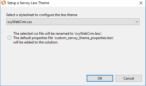
5.3 Adding Less Theme Support to an old Solution
When setting the solution stylesheet property, it is also possible to add less theme support for an old solution.
The 'Add Less Theme Support' button is available in the Solution CSS picker if the 'custom_servoy_theme_properties.less' is missing or there is no less file that imports it.
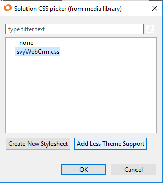
When setting up the less theme, the following situations are possible:
1. if none is selected, it will create a less file having the same name as the solution.
2. if a css file is selected, it will rename the css file to less and add the import of the 'custom_servoy_theme_properties.less' file (see the screenshot below).
3. if a less file is selected, it will add the import of the 'custom_servoy_theme_properties.less' to the beginning of the file.
Overview
Content Tools
Activity