Highlights
The Servoy 7 release introduced the Servoy Mobile Client. Servoy Mobile brings the Servoy paradigms of easy application development to the mobile arena.
Using Servoy Mobile it is easy to build Mobile Business applications that work offline, seamlessly syncronize data back and forth between the Mobile client and the backend systems and can be deployed both as native application or as webapp
To get started with Servoy Mobile, see the Servoy Mobile documentation
Servoy Developer
Still to be done in Servoy Developer
In this second alpha, the following things are still to be done:
- Improve the first launch process with the minimized perspective
- Create proper CheatSheets
- Redesign the Welcome page
- Redesign the iServoy page
- Provide option to turn off the display of the iServoy page on launch of Servoy Developer when a Servoy Developer license has been registered.
First Launch Experience
- On first launch, after the Welcome screen the Servoy Design perspective will show with all parts minimized and only the iServoy and the CheatSheet views showing
Servoy Developer UI
- CVS team support has been removed (can be added again when needed through standard Eclipse update mechanism)
- Java related features of Eclipse have been hidden from view
- Toolbars related to Form editing have been inlined into the Form Editor
- Added Color/font chooser Toolbar
- Reordered default toolbar positions to achieve a more steady ToolBar when switching between different types of Editors
- Preferences:
- Merged "Window > Preferences > Servoy > Team settings" to "Window > Preferences > Team > Servoy Team Provider"
- Removed "Window > Preferences > Servoy > Services" as they are not relevant within Servoy Developer
- Hidden several not usefull MenuItems, like File > Convert line Delimiters ....
- Moved MenuItems from Elements menu under the Actions Menu on the MenuBar
- Moved the Debug Client Launch MenuItems from the Actions menu to the Run menu
- Removed custom "New Form" option in the main toolbar and moved the New .... options into the default Eclipse mechanism for "New ..." operations (File > New or New button on toolbar or Alt-Shift-N keyboard shortcut)
- Removed Classic Search view: Search can be triggered through keyboard shortcuts as well as though buttons in the main toolbar area and the menubar
- Renamed "Profiler View" to just "Profiler"
- Hidden the Profiler view by default
- Moved Tasks view next to Bookmarks view
- Improved enabling/disabling of Solution Explorer nodes, menuItems & ToolBar buttons based on the current context
- Better visual feedback on which nodes are enabled/disabled in the Solution Explorer
- Cleaned up and aligned the Context menu's of the Form and Method Editors, to show only relevant entries and to follow the same menuitem order
Form Editor
The Form Editor in Servoy 6 has gotten a major overhaul. The main new features are a configurable Palette, alignment Guides for placing, moving & resizing elements and many keyboard shortcuts for new and existing functions. Also the Form editing toolbars have been inlined into the editor, instead of being part of the main toolbar area.
Palette
- Supports Drag 'n' Drop of elements
- Supports "click select - click place" way of placing elements
- Supports placing the same element multiple times by holding down the Control-key while drag/dropping items from the Palette
- Servoy-aware beans automatically show up in a "Servoy Beans drawer"
- Java Swing components (JXxxx-named beans) are in a separate drawer, hidden by default
- Templates automatically show up in the Templates drawer
- Templates can be applied to existing elements while dragging by dropping them while hovering over existing elements in the Form Editor. Use Control modifier to do a place, instead of an apply
- The content, display and behavior of Palette is fully customizable:
- New drawers can be created from Tamplates
- Order of drawers and elements can be altered,
- Drawers and elements can be made visible or hidden.
- The Palette can be inlined in the Form Editor (by default) or can be added to the Perspective as a regular view. In the latter case, the Palette will be automatically removed from the Form Editor. When the view is removed from the Perspective, the Palette will appear in the From Editor again automatically.
- Newly created elements have better defaults settings for their properties
- Containers (Tabpanel, Tabless Panel & Split Pane) are transparent by default (so the transparency setting of the form controls the bahavior)
- Checkbox & RadioButton fields transparent by default
- Default size of TextArea HTMLArea & RTFArea
- Media field disabled by default
- HTMLArea and RTFArea not editable by default
Alignment Guides
The Form Editor in Servoy 6 provides a sophisticated mechanism for aligning newly placed, moved or resized elements. The snapping to grid and the display of the grid have been disabled by default in favor of the new alignment guide functionality.
The new alignment snapping guides are like the grid snapping guides, but the snapping is not based on a fixed grid, but on proximity to existing elements of the form and/or the form edges.
The snapping guides offer three configurable offsets (which both work vertically and horizontally) based on proximity to other elements and form edges and one configurable indentation size based on proximity to another element.
Optionally, Smart Anchoring can be turned on: Smart Anchoring will automatically set the anchoring properly when aligning an element to one of more edges of the Form
Also added is a click-able Anchoring feedback area on selected element. Clicking the feedback icon pops up a menu with options to quickly set the anchoring options

The feedback are on the selected element provides visual feedback on how the element is anchored. Examples:
Top & Left:  , Top & Right:
  , Top, Right & Left:
  & Top, Right, Bottom & Left:
It is also possible to create custom snapping guides by right-clicking one of the rulers (The rulers must be showing). These custom guides are temporary and only for the Form Editor on which they were created. The custom guide can be removed by selecting it in the Ruler and pressing Delete.
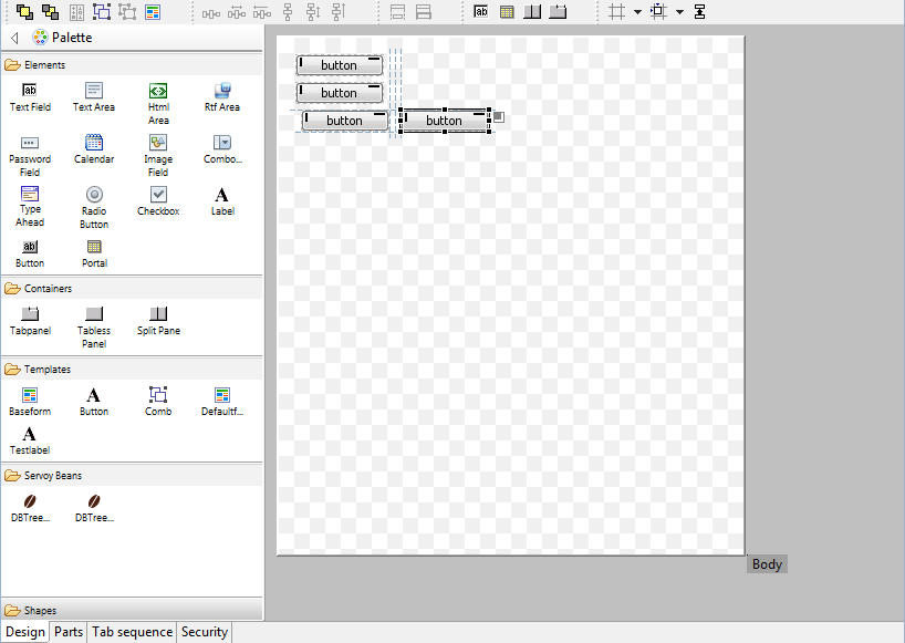
Same Width/Same Height functionality
New functionality has been added to make multiple elements have the same width and/or height. When two or more elements are selected, the Same Width and Same height functionality gets enabled:
- Available as buttons on the toolbar
- Available as entries in the context menu of the Form Editor
- Available as keyboard shortcuts (Shift-W & Shift-H)
When an element gets selected, all elements on the form that have the same width/height as the selected element also get a decorator to show that they have the same width/height as the selected element:

Keyboard shortcuts
The following keyboard shortcuts have been added:
Send to Back/Bring to Front (resp. Control+] & Control+[)
- Group/Ungroup (resp. Control+G & Control+U)
- Same Height/Same Width (resp. Shift+H & Shift+W)
- Anchoring Top - Right - Bottom - Left (resp. Shift+-, Shift+*, Shift++ & Shift+/)
- Big step move (Control-Alt-Arrow keys)
- Big step resize (Shift-Alt-Arrow keys)
Misc.
- Improved visual feedback while resizing/moving elements using the keyboard
- When placing fields through the "Place field..." button in the Toolbar of the Form Editor, the fields are placed in the order in which the dataproviders were selected in the "Select Data Providers" dialog
- Better placement of horizontally placed fields through the "Place field..." button in the Toolbar of the Form Editor
- Added option to toggle the display of the Rulers (default: on)
- Added option to toggle the display of "Page break" lines (default: off)
- Added the drawing of the Form border
- Offset the Form inside the editor viewport, for drawing the Form Border
- Visual feedback of Forms being transparent
- Added "Snapping mode" shortcut on the toolbar to quickly toggle the Alignment mechanism to use:
- None
- Grid
- Alignment (default)
- Added "Toggle Feedback options" shortcut on the Toolbar to toggle the Form Editor feedback preferences:
- Show anchoring feedback (default = true)
- Show alignment feedback (default = true)
- Show same size indicators (default = true)
- Show Grid (default = false)
- Added support for quick pan of viewport using SpaceBar+MouseDown+MouseMove (allows for quick scrolling the viewport if the Form is larger than the Form Editor area)
- Added forced lasso select for layered elements through Shift modifier when starting the select using the mouse
- Form part height can be set by double-clicking the part label
- Form parts can be resized using the keyboard
- When resizing form parts using the mouse, if the Control modifier is pressed while the resize takes place, anchored elements also are resized
- Form (parts) can be resized using the mouse by dragging their edges
- While hovering over the Form part label, a vertical resize cursor is shown
- Added location & size feedback in the status bar of Servoy Developer for the selected element
- Added "Revert Form" option to Context menu of the Form Editor, to undo all changes since the last Save at once
- Added "Preferences" option in the Context menu of the Form Editor
- When pressing the Tab key while focus is on an element in the Form Editor, the next element in the tab sequence is focused
To be done:
- Make it possible to drag Forms from the Solution Explorer directly onto existing Tabpanels/TablessPanels/SplitPanels in the Form Editor
- Make it possible to do a two dimensional form (part) resize
- Size feedback in the status bar for Form and Form parts
Script Editor
CSS Editor
A new CSS StyleSheet editor has been incorporated into Servoy Developer, with the following features:
- Syntax coloring
- Code Completion, based on supported CSS subset that Servoy supports
- Outline view for the StyleSheet
- Properties view for the selected StyleClass
- Font & Color chooser available in main toolbar area
Property Editor
- Color properties show the HEX value, instead of the RGB value
- Color properties can be directly edited. Supported values are Hex values, RGB values and named colors (i.e. black, red etc)
- Font properties can be directly edited
- When setting a property to an invalid value, an Error dialog pops up, instead of a message in the status bar and a silent revert to the old value
- Dataprovider properties that are unresolved now show the name that cannot be resolved
Miscellaneous
- Servoy MarketPlace integration
- Servoy MarketPlace can be opened in Servoy Developer, through Help > Servoy MarketPlace
- When supported by the product in the MarketPlace, the product can by instantly downloaded and installed into Servoy Developer
- Added option to show the firstForm of the solution that is being activated (see Window > Preferences > Servoy > Form Editor)
- Added predefined update url for JSDoc plugin (https://www.servoyforge.net/projects/jsdoc)
Solution development
Behavior changes
- There will be a behaviour change if a font in html_area is expressed in "pt" instead of "px" -> it will get smaller.
- Non-modal Dialogs in WC rendered inside the main window, instead of as new browser windows due to JSWindow implementation, allowing multiple modal and non modal in the same window
- application.getTimeStamp() in the Web client will return the timestamp based on the timezone of the Client and the time of the Server: Before it would just return the timestamp based on the time and timezone of the server.
- When asking for elements and/or parts of forms that extend other forms, the inherited elements/parts are also returned in Servoy 6, whereas prior to Servoy 6, only the non-inherited elements would be returned and the (hierargy of) super forms(s) had to be inspected.
- When using labels with labelFor link to other elements in TableViews to control the TableView header rendering, the first lable will now determine the height of the header
Form Design
Conditional formatting (including row coloring in grids)
Inheritance model
Misc.
Drag 'n' Drop
- onDragOver doesn't fire anymore for elements that are layered below other elements
- all drag 'n' drop events don't fire anymore on disabled elements
Web Client specific
- DND operations can be canceled by the Escape key (Behavior already existing in the Smart Client)
- When onDrag returns DND.NONE, the
Solution Model
Client Design mode
Scripting API
Plugins & Beans
New OpenID plugin
Dialogs plugin
DBTree(Table)View beans
PDF plugin
PDF Output plugin
Misc.
Public Java API
Overview
Content Tools
Activity